Read our search syntax documentation for more information on how to write search queries.
Overview
Visualizations is a feature that allows users to displayed the data returned from searches. Using the search query editor you can select from List, Timeseries, Table, Top List, Pie Chart and Tree Map views to visualize your data.List
List displays the results that are returned from your search query. This alows you to review a group of events. From here you can toggle to full screen mode, table view and sort results by oldest first. In List view selecting the options menu will display several toggle features which you can choose from the following options: Timeline graph, Wrap lines, date column, content column. From this option page you can also add further columns based on your results.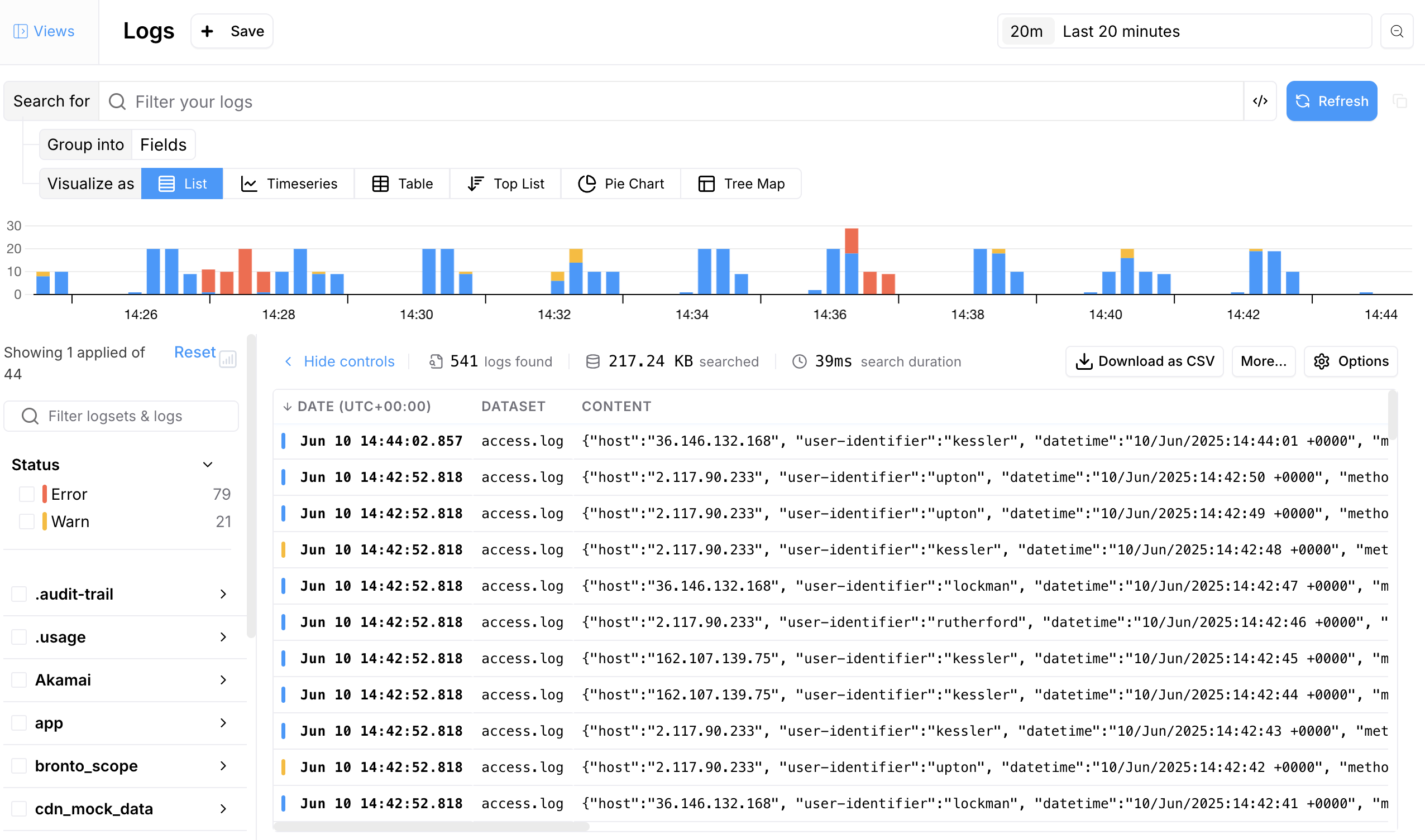
Timeseries
Visualize your data over a selected timeframe. Toggle between viewing as Line graph or Bar chart. Adding further groups, the timeline will plot and graph the key and values.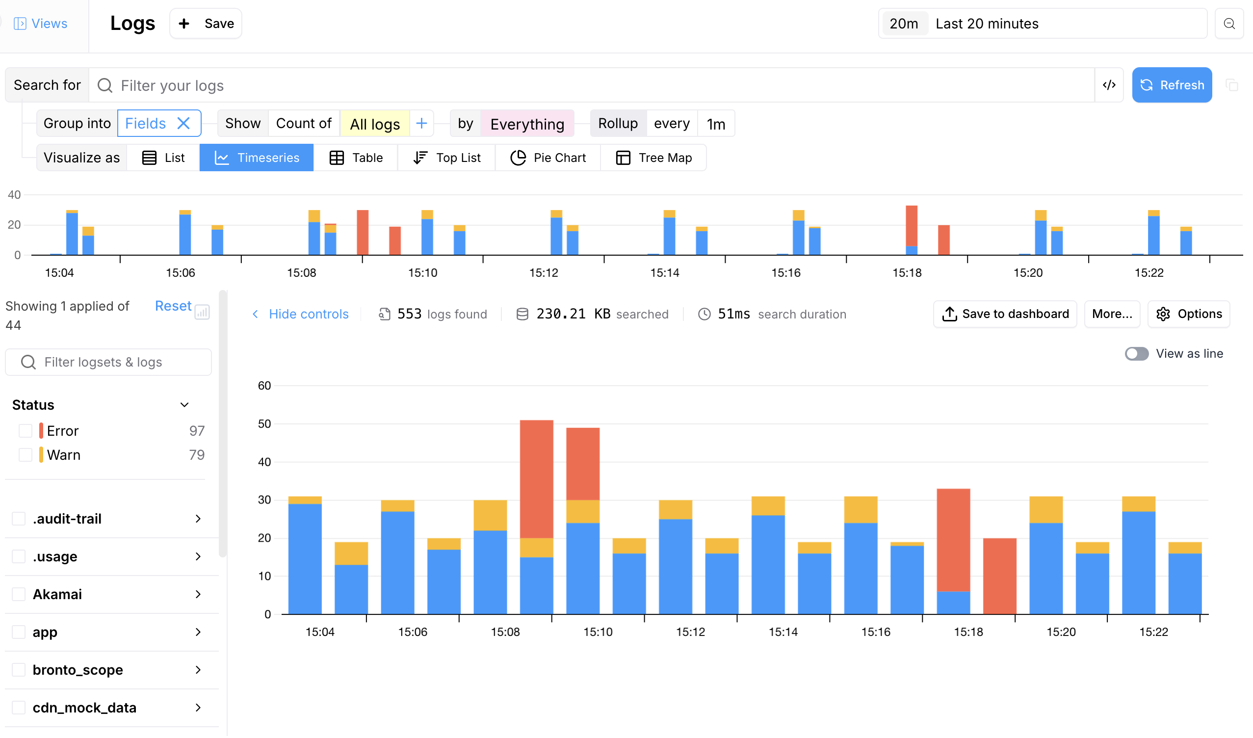
Table
A table view is a way to represent your data in a structured, tabular format. This format allows users to quickly scan and understand the data by organizing it into rows and columns depending on the fields selected.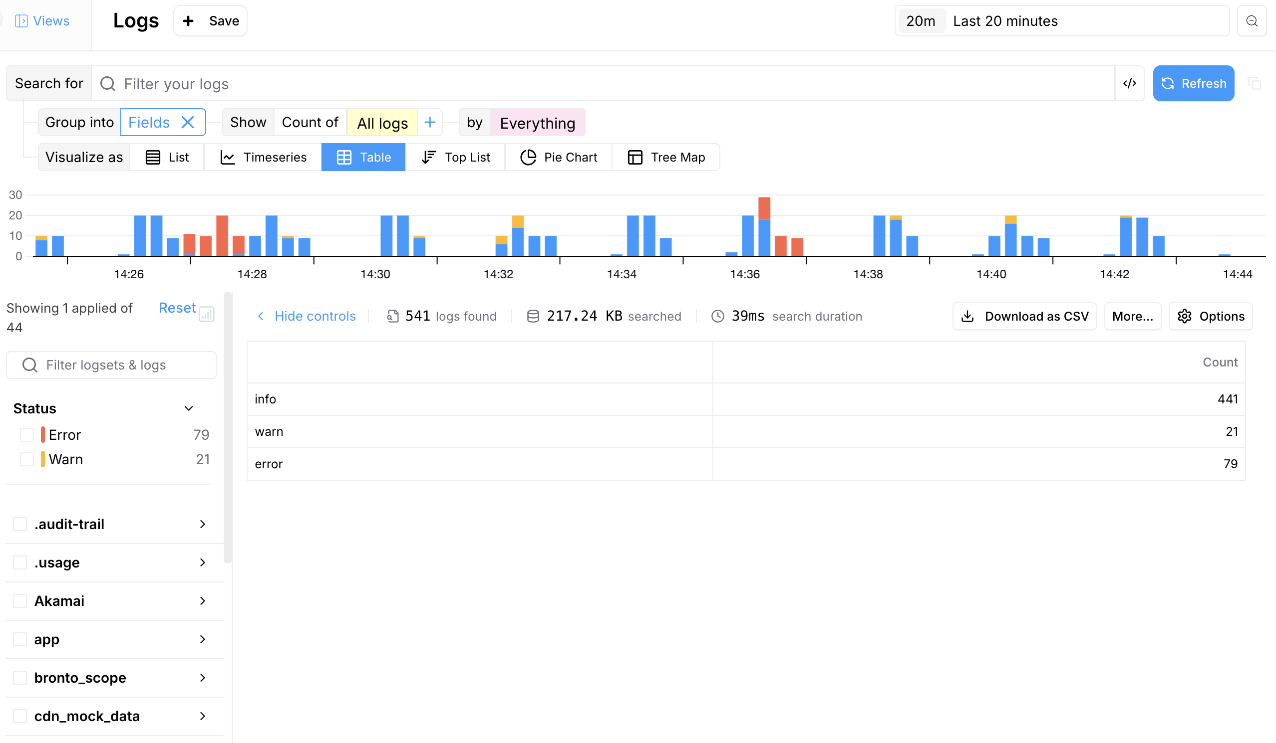
Pie Chart
A pie chart can be used to visualize the distribution of various events or categories, making it easier to understand the relative frequency or importance of different types of data.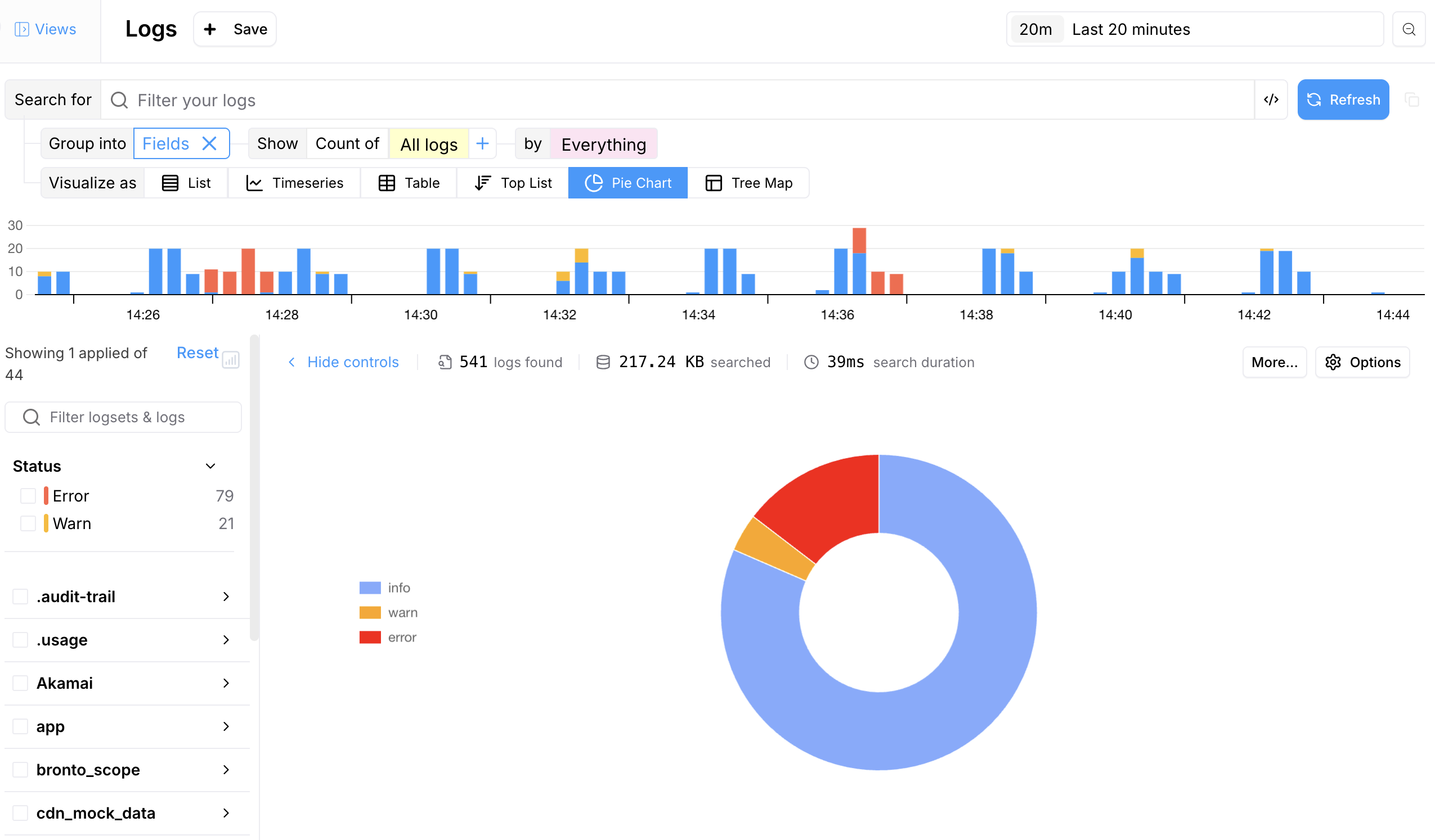
Top List
A top list chart is used to display the most frequent or critical events, errors, or sources, helping prioritize issues that need attention.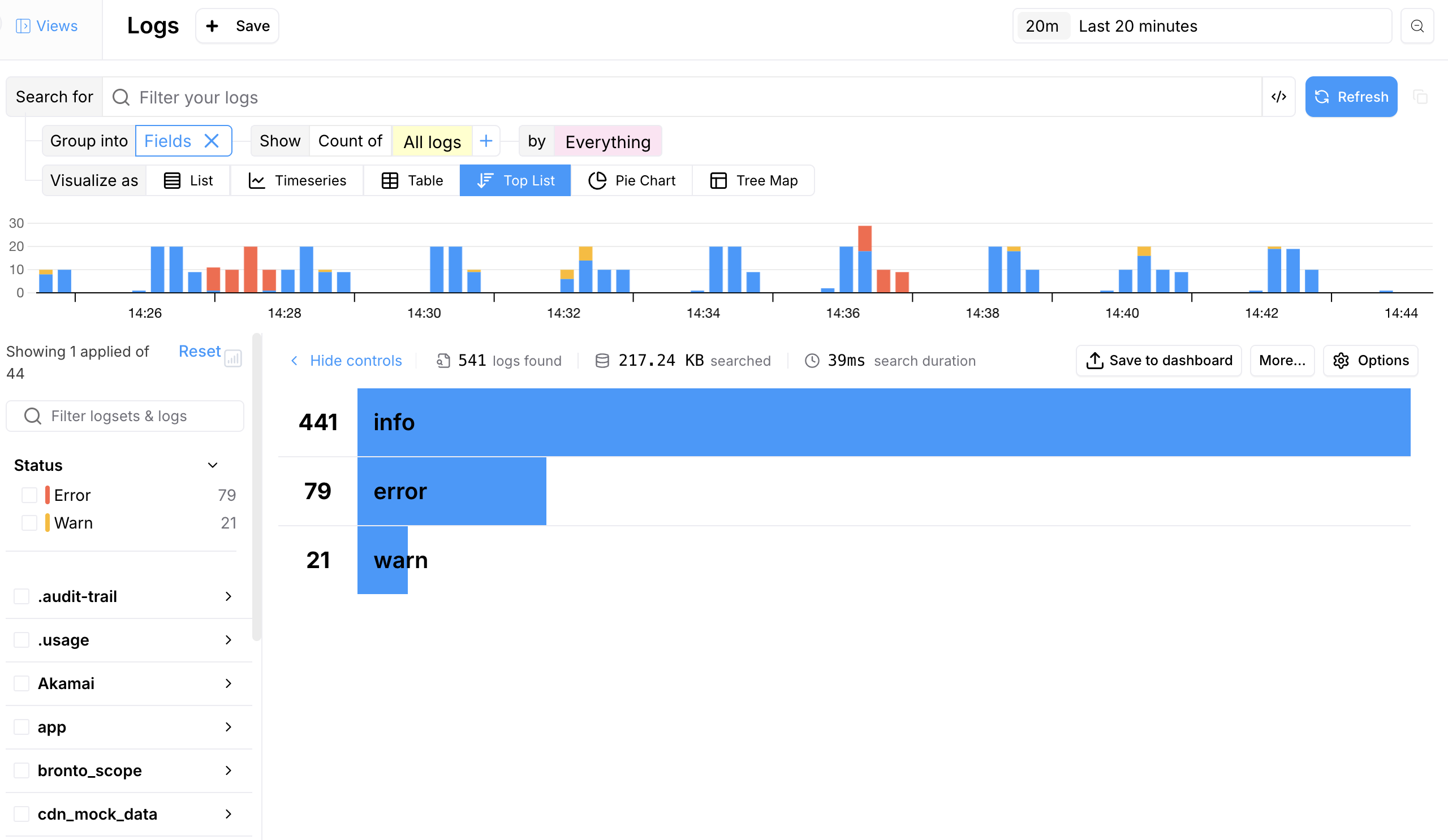
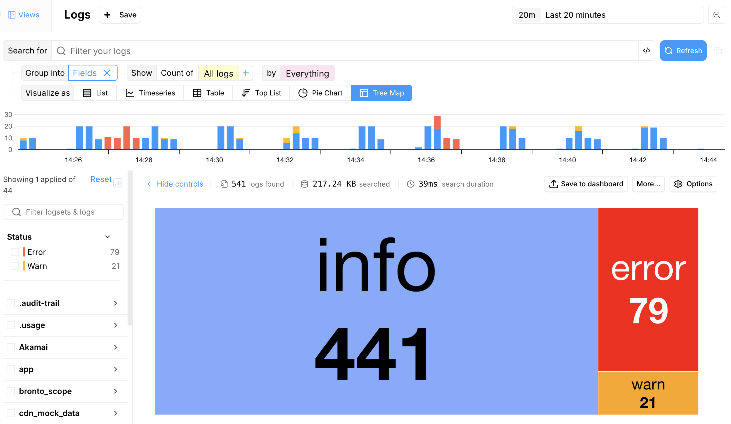
Tree Map
Tree maps help visualize hierarchical data, showing proportions and relationships within the data set and gain valuable insights into the hierarchical structure and distribution of your data, aiding in performance monitoring, resource allocation, and issue detection.