

Overview
You can build a custom service map, focused operational view, or workflow-specific interface on top of Bronto data. In this context, vibe building means using AI-assisted UI generation tools such as Lovable and v0 to build a frontend quickly while Bronto provides the observability data and APIs behind it. The fastest way to start is to remix Bronto’s Lovable baseline template, which already wires up Search, tracing, dashboards, and usage views against the Bronto API. If you prefer Vercel, the BrontoVibe v0 example is a deploy-your-own version of the same idea — ship it to Vercel, then refine it with the v0 agent in the Vercel platform using natural-language prompts. For a full walkthrough, see the BrontoVibe blog post.The examples on this page are starting points, not limits. Once you can query Bronto data and shape it into a UI, you can build many different workflow-specific experiences on top of the platform.
Prerequisites
This guide assumes you already have a Bronto account and have sent data to Bronto. If you haven’t ingested data yet, set up an agent first. You will also need:- a Bronto API key with access to the features your interface uses. The baseline template uses Search, tracing, dashboards, and usage, so generate a key with full access. See API Keys.
- a UI generation or app-building tool such as Lovable or v0, or your own frontend stack.
When to use this approach
Vibe building works best when you want to create a workflow-specific experience on top of Bronto data, for example:- a team-specific dashboard
- a customer or tenant-specific operational view
- a custom service map that links directly into your investigation workflow
Core building blocks
Most custom interfaces built on top of Bronto use a small set of platform concepts. See the glossary for full definitions:- API Key — authenticate your custom UI or internal app
- Search — query Bronto data for custom tables, charts, filtered views, and workflow screens
- My Data — understand datasets, ingestion, and search usage
- Dataset — the unit of log storage your log queries run against
- Trace — derive service maps and trace-linked workflows from OpenTelemetry data
Recommended setup flow
1
Start from a baseline template
Remix Bronto’s Lovable baseline template to start with Search, tracing, dashboards, and usage already wired up. To deploy your own to Vercel instead, start from the BrontoVibe v0 example and refine it with the v0 agent in the Vercel platform using natural-language prompts.
2
Generate a Bronto API key
Create a dedicated API key for the app and give it access to the features your interface uses.
3
Customize with natural-language prompts
Describe the workflow-specific interface you want and let the tool generate it on top of Bronto data. See Recommended prompt inputs for what to include.
4
Link back into Bronto for deeper investigation
Keep the custom UI focused. When users need more context, link them back to Bronto search or trace exploration.
Recommended prompt inputs
When using Lovable or v0, prompts work best when they clearly define:- the user or team the UI is for
- the exact workflow the UI should support
- which Bronto API should supply the data
- the filters, charts, tables, or graph views the page should include
- where the UI should link back into Bronto
Example: user-built custom service map
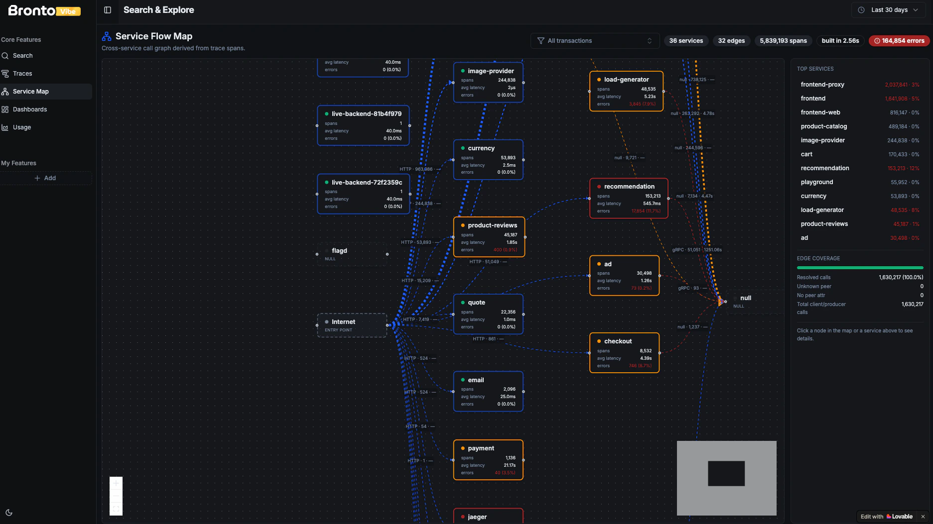
A strong pattern is a custom service map built with Lovable on top of OpenTelemetry trace data already in Bronto. This is useful when you want a workflow-specific topology view instead of a general-purpose tracing UI. For example, a team may want to highlight only production services, emphasize error-heavy edges, or make each node link into a trace investigation flow. What this usually looks like in practice:- a node graph of services and dependencies
- edge labels showing call volume or protocol
- color or emphasis based on latency or error rate
- a side panel for the selected service
- direct links into traces or related logs
- nodes for services, queues, gateways, and external dependencies
- edges representing calls between services
- span count, average latency, and error rate on each node or edge
- filters for environment, time range, transaction type, or service group
- click-through actions that open traces or related logs for the selected service
Example prompt
Additional examples
The same setup pattern can support many other interfaces beyond the main example above.Usage and cost view
While Bronto already includes in-product usage tooling, some teams may still want to embed usage and cost data into another internal tool, team portal, or customer-specific view using the Usage API.Support-facing operational view
A support team can build a focused screen that shows recent customer-facing errors, affected services, and links into the relevant logs or traces without exposing the full Bronto experience to every user.Release-health screen
A delivery or platform team can build a deployment-window view that focuses on regressions immediately after a release, combining search results, error trends, and service-level indicators in one place.Best practices
- start with one narrow workflow instead of trying to recreate the full Bronto UI
- create a dedicated API key for each custom app
- link back into Bronto whenever users need deeper context or broader exploration