> ## Documentation Index
> Fetch the complete documentation index at: https://docs.bronto.io/llms.txt
> Use this file to discover all available pages before exploring further.
# Dashboards
> Build Bronto dashboards from metrics and other telemetry to visualize application performance, track trends, and share live views with your team.
## Overview
Navigate to the Dashboard page in Bronto by clicking on the "Dashboards" item in the application sidebar.
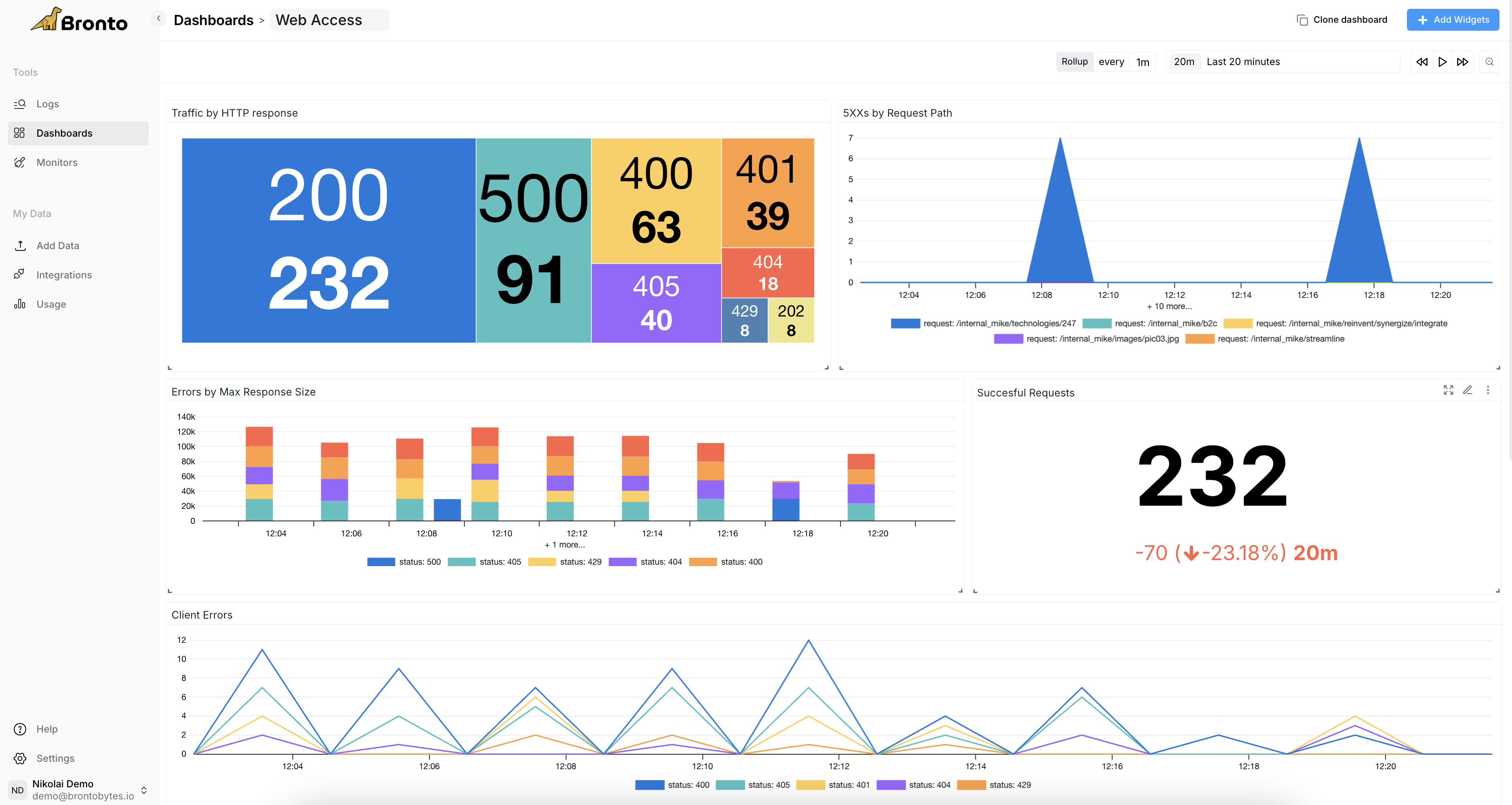 ## Create a new Dashboard
To create a new Dashboard, click on the "New Dashboard" button in the application sidebar.
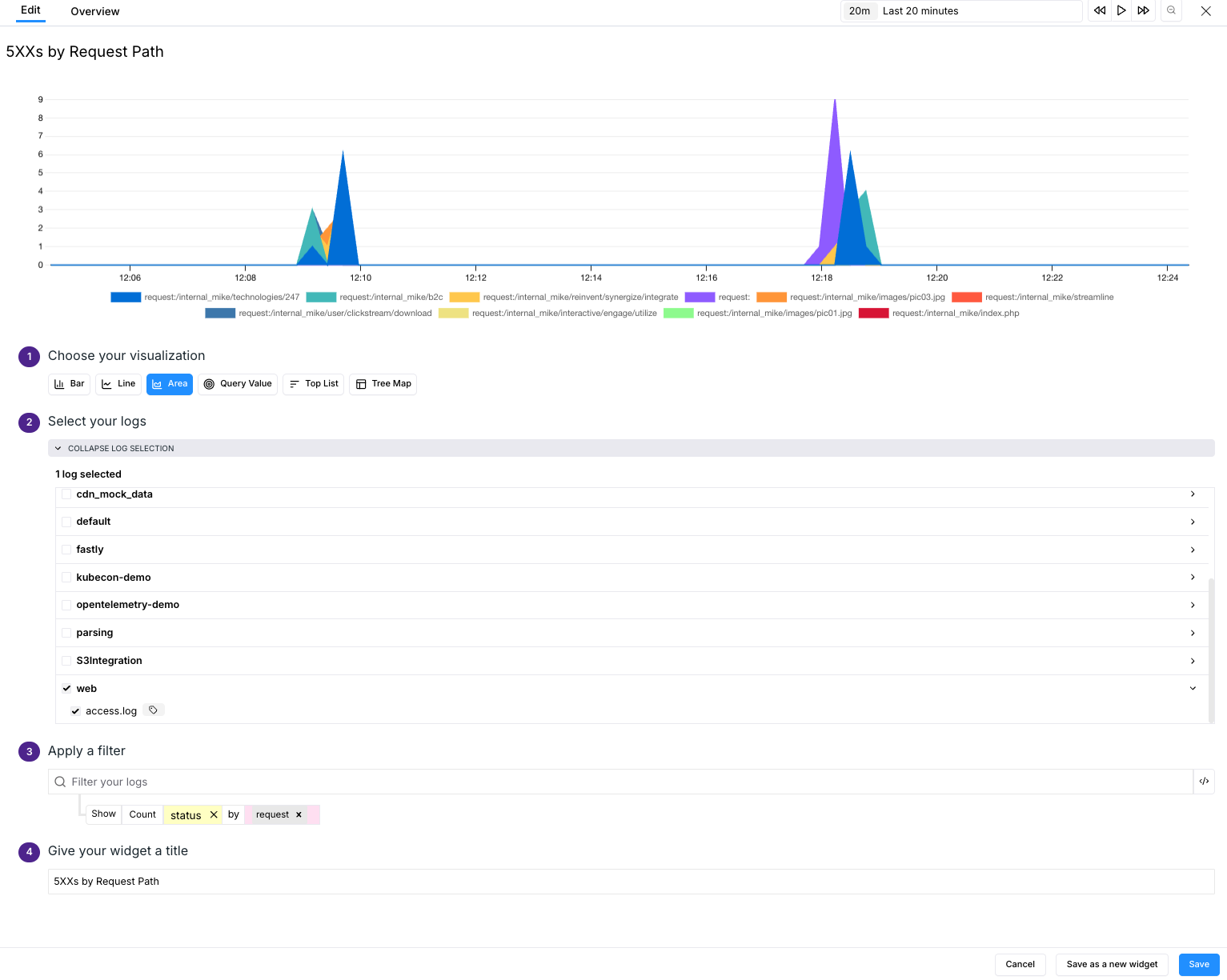
1. Choose a name for your Dashboard.
2. Once the dashboard is created, click Add Widgets.
3. Choose a visualization type for your metric (e.g. Bar, Line, Area, Query Value, Top List, or Tree Map).
4. Select the data you want to associate with the widget.
5. Apply a filter. For more details, see the [Search Syntax help page](/query-syntax/search-syntax).
6. Lastly, give the widget a title and select Save. Save up to 50 widgets per dashboard.
## Create a new Dashboard
To create a new Dashboard, click on the "New Dashboard" button in the application sidebar.
1. Choose a name for your Dashboard.
2. Once the dashboard is created, click Add Widgets.
3. Choose a visualization type for your metric (e.g. Bar, Line, Area, Query Value, Top List, or Tree Map).
4. Select the data you want to associate with the widget.
5. Apply a filter. For more details, see the [Search Syntax help page](/query-syntax/search-syntax).
6. Lastly, give the widget a title and select Save. Save up to 50 widgets per dashboard.
 ## Add Queries and Formulas to Widgets
Use **+ Add Query** and **+ Add Formula** to build a widget from more than one query result. Each query has a name, such as `bytes` or `events`, which you can reference in a formula.
### Add a Query
Select **+ Add Query** to add another independently configured query to the widget. The new query can use a different scope, filter, aggregation, or grouping from the first query.
For example, to prepare a widget that visualizes the average number of bytes per event:
1. Configure query `bytes` to return the sum of `bytes_total`.
2. Select **+ Add Query**.
3. Configure query `events` to return the sum of `event_count`.
The widget now has the total bytes in `bytes` and the total event count in `events`.
### Add a Formula
Select **+ Add Formula** to calculate a value from numbers, query results, or a combination of both. Reference a query by entering its query name in the formula.
Formulas support:
* Parentheses: `(` and `)`
* Addition, subtraction, multiplication, and division: `+`, `-`, `*`, and `/`
* Numerical constants, including decimals, such as `100`, `5`, or `1.5`
* Variables that match the names of queries in the widget
Variable names must be alphanumeric and start with a letter. Only variables based on query names in the widget are allowed. You can reference any number of variables in a formula, and each widget can include up to six queries.
You can also use `+` and `-` as unary operators to explicitly set the sign of a value. For example, `bytes + -5`, `-events + 1000`, and `bytes + +events` are valid formulas.
Continuing the bytes-per-event example:
1. Select **+ Add Formula**.
2. Enter `bytes / events` to divide the total bytes by the total event count.
3. Select a visualization type and save the widget.
The widget displays the average number of bytes per event.
## AI Widget Creator
Bronto includes an AI assistant that can create dashboard widgets for you from a plain English prompt. This removes the need to manually configure datasets, aggregations, filters, and visualization types — useful when you're unfamiliar with the underlying data.
### How to use it
1. Open an existing dashboard and click **Add Widget**.
2. At the top of the widget creation form, enter a prompt describing what you want to see. For example: *"show me the errors in my data in the last hour"*.
3. The AI will automatically populate the form fields below — dataset selection, visualization type, aggregation, filters, and widget name.
4. The preview updates instantly so you can see the result before saving.
5. If the output looks right, click **Save**. If not, adjust the form fields manually or send a follow-up prompt to refine it further.
### Real-time feedback
As soon as you submit a prompt you'll see live status updates showing what the AI is doing — loading context, processing your request, validating the widget — before it replies with an explanation of what it created.
### Iterating on a widget
If the first result isn't quite right you have two options:
* **Manually adjust** the form fields directly.
* **Continue the conversation** by sending a follow-up prompt with more context. The assistant retains the session so it understands your previous messages.
## Visualization Types
Visualization types are the various charts you can include in your widget to display your data.
### **Bar Graph**
A bar graph is a visual representation of data that helps analyze and interpret the frequency, volume, or other metrics associated with your data. Example usages include showing error frequency over time, log volume by source, and request counts by status code.
### **Line Graph**
A line graph is a graphical representation of information that changes over a period of time. It is a chart made by joining points using line segments. Line graphs are particularly effective for showing trends and patterns over a continuous period. They are ideal for understanding how metrics change over time. Example usage includes error rates over time, throughput over time, and displaying response times.
### **Area Graph**
An Area Graph is a visual representation of data that utilizes both lines and filled areas to convey information over a period of time. This type of chart is particularly effective in showcasing data trends and variations over a specified period or across different categories.
### **Query Value**
This widget can display the latest value from your various search queries across a specific time window.
### **Top List**
The top list visualization enables you to display a list of search values with the most or least of any metric or event value. Examples include graphing CPU usage, disk space, or costs of particular services.
### **Tree Map**
Tree maps are used to represent hierarchical data as nested rectangles. They help in understanding the structure and distribution of data within a hierarchy. Examples include log volume by source and type, error distribution across services, resource allocation, and other hierarchical metrics.
### **Percentiles**
Analyze your data with percentile views, including P75, P90, P95, and P99, for deeper insights into performance and trends.
## **Full-Screen Mode**
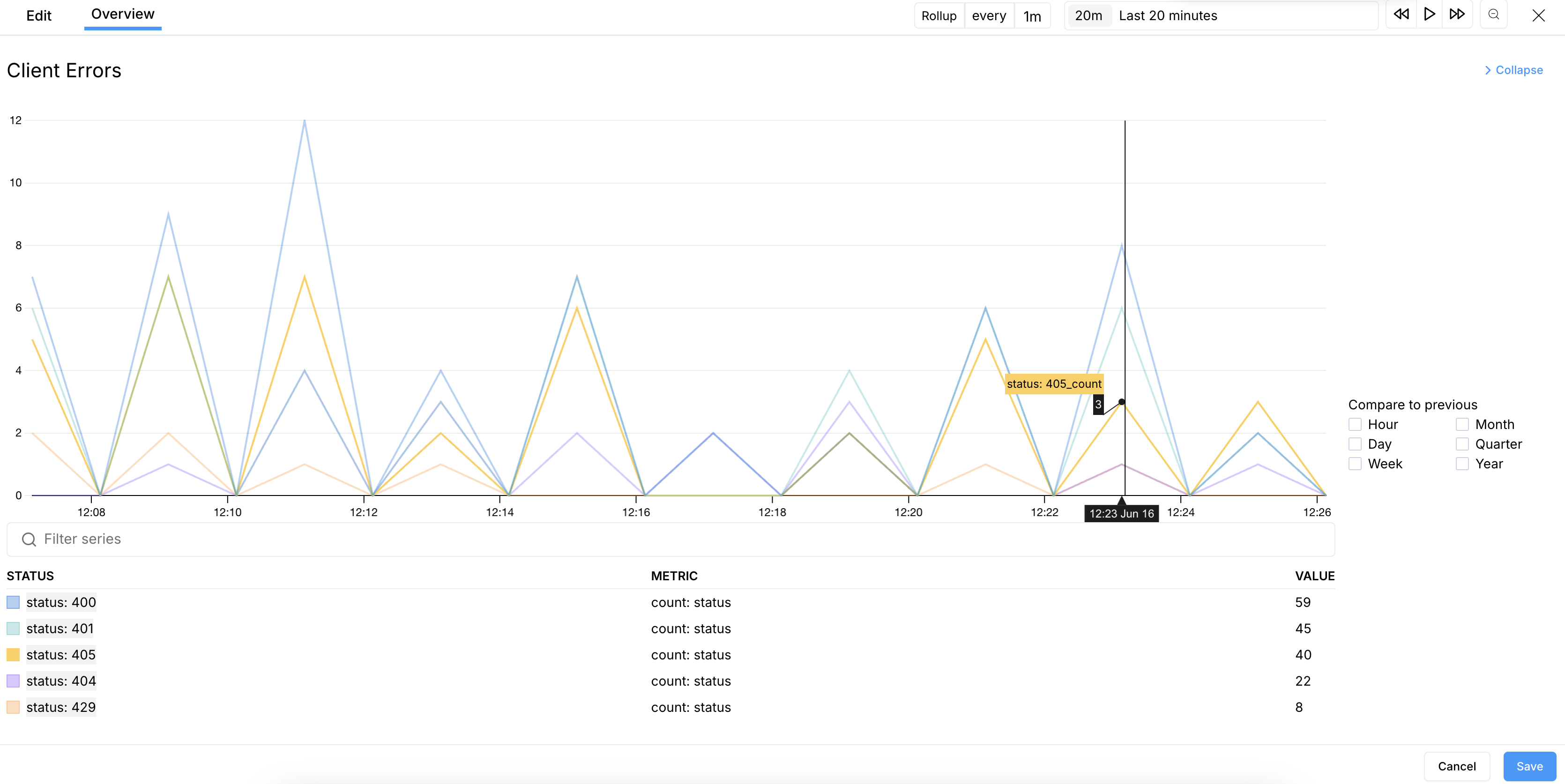
In full-screen widget mode, when using bar, line, or area visualizations, you can now chart and compare previous time periods by days, weeks, months, or years.
The full-screen mode toggle is located in the top right of each widget, next to the edit options. You can also select or deselect keys to customize the data displayed on the graph.
## Add Queries and Formulas to Widgets
Use **+ Add Query** and **+ Add Formula** to build a widget from more than one query result. Each query has a name, such as `bytes` or `events`, which you can reference in a formula.
### Add a Query
Select **+ Add Query** to add another independently configured query to the widget. The new query can use a different scope, filter, aggregation, or grouping from the first query.
For example, to prepare a widget that visualizes the average number of bytes per event:
1. Configure query `bytes` to return the sum of `bytes_total`.
2. Select **+ Add Query**.
3. Configure query `events` to return the sum of `event_count`.
The widget now has the total bytes in `bytes` and the total event count in `events`.
### Add a Formula
Select **+ Add Formula** to calculate a value from numbers, query results, or a combination of both. Reference a query by entering its query name in the formula.
Formulas support:
* Parentheses: `(` and `)`
* Addition, subtraction, multiplication, and division: `+`, `-`, `*`, and `/`
* Numerical constants, including decimals, such as `100`, `5`, or `1.5`
* Variables that match the names of queries in the widget
Variable names must be alphanumeric and start with a letter. Only variables based on query names in the widget are allowed. You can reference any number of variables in a formula, and each widget can include up to six queries.
You can also use `+` and `-` as unary operators to explicitly set the sign of a value. For example, `bytes + -5`, `-events + 1000`, and `bytes + +events` are valid formulas.
Continuing the bytes-per-event example:
1. Select **+ Add Formula**.
2. Enter `bytes / events` to divide the total bytes by the total event count.
3. Select a visualization type and save the widget.
The widget displays the average number of bytes per event.
## AI Widget Creator
Bronto includes an AI assistant that can create dashboard widgets for you from a plain English prompt. This removes the need to manually configure datasets, aggregations, filters, and visualization types — useful when you're unfamiliar with the underlying data.
### How to use it
1. Open an existing dashboard and click **Add Widget**.
2. At the top of the widget creation form, enter a prompt describing what you want to see. For example: *"show me the errors in my data in the last hour"*.
3. The AI will automatically populate the form fields below — dataset selection, visualization type, aggregation, filters, and widget name.
4. The preview updates instantly so you can see the result before saving.
5. If the output looks right, click **Save**. If not, adjust the form fields manually or send a follow-up prompt to refine it further.
### Real-time feedback
As soon as you submit a prompt you'll see live status updates showing what the AI is doing — loading context, processing your request, validating the widget — before it replies with an explanation of what it created.
### Iterating on a widget
If the first result isn't quite right you have two options:
* **Manually adjust** the form fields directly.
* **Continue the conversation** by sending a follow-up prompt with more context. The assistant retains the session so it understands your previous messages.
## Visualization Types
Visualization types are the various charts you can include in your widget to display your data.
### **Bar Graph**
A bar graph is a visual representation of data that helps analyze and interpret the frequency, volume, or other metrics associated with your data. Example usages include showing error frequency over time, log volume by source, and request counts by status code.
### **Line Graph**
A line graph is a graphical representation of information that changes over a period of time. It is a chart made by joining points using line segments. Line graphs are particularly effective for showing trends and patterns over a continuous period. They are ideal for understanding how metrics change over time. Example usage includes error rates over time, throughput over time, and displaying response times.
### **Area Graph**
An Area Graph is a visual representation of data that utilizes both lines and filled areas to convey information over a period of time. This type of chart is particularly effective in showcasing data trends and variations over a specified period or across different categories.
### **Query Value**
This widget can display the latest value from your various search queries across a specific time window.
### **Top List**
The top list visualization enables you to display a list of search values with the most or least of any metric or event value. Examples include graphing CPU usage, disk space, or costs of particular services.
### **Tree Map**
Tree maps are used to represent hierarchical data as nested rectangles. They help in understanding the structure and distribution of data within a hierarchy. Examples include log volume by source and type, error distribution across services, resource allocation, and other hierarchical metrics.
### **Percentiles**
Analyze your data with percentile views, including P75, P90, P95, and P99, for deeper insights into performance and trends.
## **Full-Screen Mode**
In full-screen widget mode, when using bar, line, or area visualizations, you can now chart and compare previous time periods by days, weeks, months, or years.
The full-screen mode toggle is located in the top right of each widget, next to the edit options. You can also select or deselect keys to customize the data displayed on the graph.